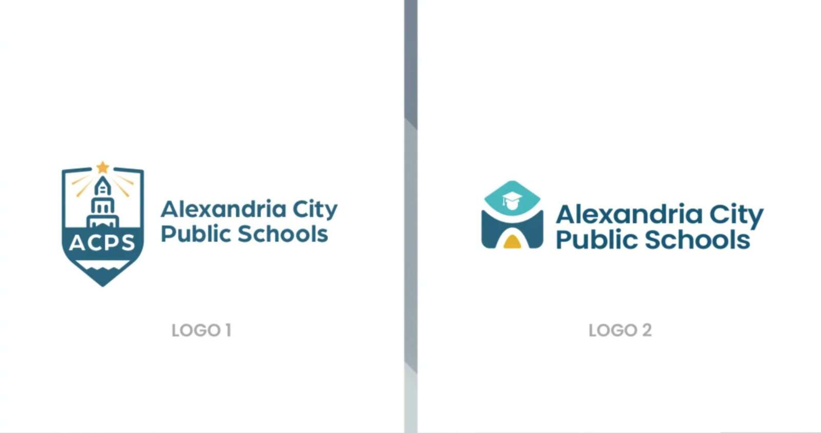
Alexandria City Public Schools has unveiled two new logos, both of which are getting skewered by parents on social media.
ACPS is asking students, families and staff to weigh in on the two options for “consideration in the superintendent’s final recommendation” by Dec. 18. Last year’s effort to redesign the logo were denied 7-2 by the School Board.
“The two logo options were created to represent the mission, vision and core values of our diverse ACPS community in an updated design reflective of ACPS’ Strategic Plan goals, including an equitable education for all here in our beautiful City of Alexandria,” ACPS said.
The first option depicts the George Washington Masonic National Memorial, which was initially designed to resemble the lighthouse in ancient Alexandria, Egypt.
“The design also incorporates the water that surrounds Alexandria and translates into a pencil to symbolize learning at the tip of the shield,” ACPS said.
The second option combines a school house with a person, with shaded pieces coming together to form the whole student, according to ACPS.
No ACPS staff or School Board Members commented online, however School Board District A Candidate Gina Baum said online that she couldn’t elaborate on the designs.
“I can’t – they both suck,” Baum wrote on Facebook.
As of Monday morning, the ACPS Facebook post on the logos had more than 80 comments, most of which were negative. Many online commenters wrote that the logos represent misplaced priorities by a school system experiencing a staffing crisis.
“Gosh I’m so glad we are focusing energy on a new logo when we don’t have teachers for core classes,” wrote one commenter. “Read the room, ACPS.”
We are redesigning the ACPS logo and invite you to share your input. The two logo options were created to represent the mission, vision and core values of our diverse ACPS community in an updated design reflective of ACPS’ Strategic Plan goals. https://t.co/A1L3KwxeSx
— Alexandria City Public Schools (@ACPSk12) December 9, 2023

